
Building a Flutter Recipe App: Part 1 - Home Screen
- zyrridian
- Tutorial , Flutter , Mobile development
- January 31, 2025
Table of Contents
In this three-part tutorial series, we’ll build a beautiful, modern recipe app called “Flavor Fusion” using Flutter. This app will feature a clean design with a home screen displaying recipe categories and popular recipes, detailed recipe pages, and a user profile screen.
By the end of this first article, we’ll have created a functional home screen with a custom app bar, category cards, and recipe listings. Let’s get started!
Setting Up the Project
First, let’s create a new Flutter project and set up our main app structure. We’ll start by configuring our app theme, creating our data models, and setting up navigation.
Main App Configuration
Let’s begin with our main.dart file to set up the app theme and initial home screen:
import 'package:flutter/material.dart';
import 'package:recipe_app/presentation/home/home_screen.dart';

void main() {
  runApp(const MainApp());
}

class MainApp extends StatelessWidget {
  const MainApp({super.key});

  @override
  Widget build(BuildContext context) {
    return MaterialApp(
      debugShowCheckedModeBanner: false,
      title: 'Flavor Fusion',
      theme: ThemeData(
        primaryColor: Color(0xFF5C9F42),
        colorScheme: ColorScheme.fromSeed(
          seedColor: Color(0xFF5C9F42),
          brightness: Brightness.light,
        ),
        fontFamily: 'Poppins',
        useMaterial3: true,
      ),
      home: HomeScreen(),
    );
  }
}
Here we’re configuring our app with:
- A green primary color (#5C9F42)
- Poppins as our font family
- Material 3 design system
- No debug banner
- HomeScreen as our starting point
Creating Placeholder Screens
Before we create the HomeScreen, we need to create placeholder screens for our recipe list and profile screens to avoid compilation errors. Let’s create these files:
First, create lib/presentation/list/recipe_list_screen.dart:
import 'package:flutter/material.dart';

class RecipeListScreen extends StatelessWidget {
  const RecipeListScreen({super.key});

  @override
  Widget build(BuildContext context) {
    return Scaffold(
      body: Center(
        child: Text('Recipe List Screen - Coming Soon'),
      ),
    );
  }
}
Then, create lib/presentation/profile/profile_screen.dart:
import 'package:flutter/material.dart';

class ProfileScreen extends StatelessWidget {
  const ProfileScreen({super.key});

  @override
  Widget build(BuildContext context) {
    return Scaffold(
      body: Center(
        child: Text('Profile Screen - Coming Soon'),
      ),
    );
  }
}
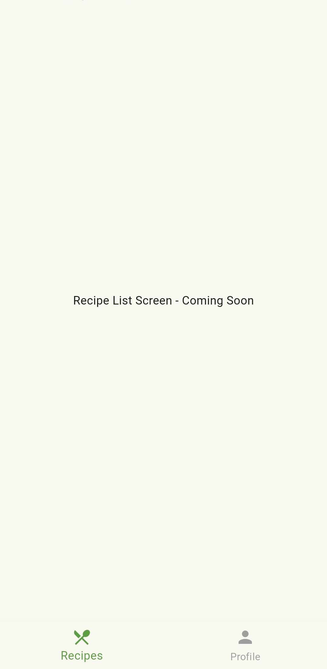
These are simple placeholder screens that we’ll build out in detail in Parts 2 and 3 of this tutorial. For now, they just display a centered text message.
Creating the Home Screen
Now that we have our placeholder screens, let’s create our HomeScreen which will handle navigation between our recipe list and profile screens:
import 'package:flutter/material.dart';
import 'package:recipe_app/presentation/profile/profile_screen.dart';
import 'package:recipe_app/presentation/list/recipe_list_screen.dart';

class HomeScreen extends StatefulWidget {
  const HomeScreen({super.key});

  @override
  State<HomeScreen> createState() => _HomeScreenState();
}

class _HomeScreenState extends State<HomeScreen> {
  int _selectedIndex = 0;

  @override
  Widget build(BuildContext context) {
    return Scaffold(
      body: _selectedIndex == 0 ? RecipeListScreen() : ProfileScreen(),
      bottomNavigationBar: BottomNavigationBar(
        currentIndex: _selectedIndex,
        onTap: (index) {
          setState(() {
            _selectedIndex = index;
          });
        },
        selectedItemColor: Theme.of(context).primaryColor,
        unselectedItemColor: Colors.grey,
        items: [
          BottomNavigationBarItem(
            icon: Icon(Icons.restaurant_menu),
            label: 'Recipes',
          ),
          BottomNavigationBarItem(
            icon: Icon(Icons.person),
            label: 'Profile',
          ),
        ],
      ),
    );
  }
}
This creates:
- A stateful widget to track which tab is selected
- A bottom navigation bar with two options (Recipes and Profile)
- Logic to switch between screens based on the selected tab
Setting Up Data Models
Before we dive into the recipe list screen, let’s create our Recipe model and some dummy data:
// lib/data/recipe.dart
class Recipe {
  final String name;
  final String chef;
  final String imageUrl;
  final String cookTime;
  final String difficulty;
  final double rating;
  final List<String> ingredients;
  final List<String> steps;

  Recipe({
    required this.name,
    required this.chef,
    required this.imageUrl,
    required this.cookTime,
    required this.difficulty,
    required this.rating,
    required this.ingredients,
    required this.steps,
  });
}
Now, let’s populate some dummy data for our recipes:
// lib/data/dummy.dart
import 'package:recipe_app/data/recipe.dart';

final List<Recipe> recipes = [
  Recipe(
    name: "Avocado Toast with Poached Eggs",
    chef: "Emma Wilson",
    imageUrl: "assets/images/avocado_toast.jpg",
    cookTime: "15 min",
    difficulty: "Easy",
    rating: 4.8,
    ingredients: [
      "2 slices whole grain bread",
      "1 ripe avocado",
      "2 eggs",
      "Cherry tomatoes",
      "Red pepper flakes",
      "Salt and pepper to taste",
      "Fresh lime juice",
    ],
    steps: [
      "Toast the bread until golden and crispy.",
      "Mash the avocado and spread on toast.",
      "Poach the eggs in simmering water for 3 minutes.",
      "Top toast with eggs, sliced tomatoes, and seasonings.",
    ],
  ),
  // More recipes...
];
With our data models in place, we can now focus on building our recipe list screen.
Building the Recipe List Screen
Now, let’s build our main recipe list screen. We’ll create it step by step:
Creating the SliverAppBar
We’ll start by creating a custom app bar using SliverAppBar for a more dynamic scrolling experience:
import 'package:flutter/material.dart';
import 'package:recipe_app/data/dummy.dart';

class RecipeListScreen extends StatelessWidget {
  const RecipeListScreen({super.key});

  @override
  Widget build(BuildContext context) {
    return Scaffold(
      backgroundColor: Color(0xFFF9F9F9),
      body: CustomScrollView(
        slivers: [
          SliverAppBar(
            expandedHeight: 120,
            floating: true,
            pinned: true,
            backgroundColor: Colors.white,
            elevation: 0,
            flexibleSpace: FlexibleSpaceBar(
              title: Text(
                'Flavor Fusion',
                style: TextStyle(
                  color: Colors.black87,
                  fontWeight: FontWeight.bold,
                ),
              ),
              centerTitle: false,
              titlePadding: EdgeInsets.only(left: 16, bottom: 16),
            ),
            actions: [
              IconButton(
                icon: Icon(Icons.search, color: Colors.black87),
                onPressed: () {},
              ),
              IconButton(
                icon: Icon(Icons.favorite_border, color: Colors.black87),
                onPressed: () {},
              ),
            ],
          ),
          // We'll add more slivers here later
        ],
      ),
    );
  }
}
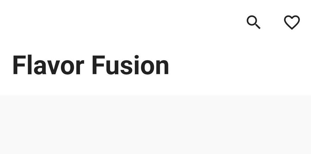
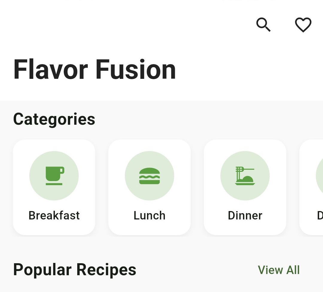
The SliverAppBar gives us:
- A nice expandable header with our app name
- Search and favorites icons
- Smooth scrolling behavior where the header collapses as you scroll down
Adding Category Section
Next, let’s add a horizontal scrolling category section:
// Add these slivers after the SliverAppBar
SliverToBoxAdapter(
  child: Padding(
    padding: EdgeInsets.symmetric(horizontal: 16, vertical: 8),
    child: Text(
      'Categories',
      style: TextStyle(
        fontSize: 20,
        fontWeight: FontWeight.bold,
      ),
    ),
  ),
),
SliverToBoxAdapter(
  child: SizedBox(
    height: 120,
    child: ListView(
      padding: EdgeInsets.symmetric(horizontal: 8),
      scrollDirection: Axis.horizontal,
      children: [
        _buildCategoryCard('Breakfast', 'assets/images/breakfast.jpg', context),
        _buildCategoryCard('Lunch', 'assets/images/lunch.jpg', context),
        _buildCategoryCard('Dinner', 'assets/images/dinner.jpg', context),
        _buildCategoryCard('Desserts', 'assets/images/desserts.jpg', context),
        _buildCategoryCard('Smoothies', 'assets/images/smoothies.jpg', context),
      ],
    ),
  ),
),
And implement the _buildCategoryCard method in the same class after Widget build() block:
Widget _buildCategoryCard(
  String title,
  String imageUrl,
  BuildContext context,
) {
  return Padding(
    padding: EdgeInsets.symmetric(horizontal: 8, vertical: 2),
    child: GestureDetector(
      onTap: () {},
      child: Container(
        width: 100,
        decoration: BoxDecoration(
          borderRadius: BorderRadius.circular(15),
          color: Colors.white,
          boxShadow: [
            BoxShadow(
              color: Colors.black.withOpacity(0.05),
              blurRadius: 5,
              offset: Offset(0, 3),
            ),
          ],
        ),
        child: Column(
          mainAxisAlignment: MainAxisAlignment.center,
          children: [
            Container(
              height: 60,
              width: 60,
              decoration: BoxDecoration(
                color: Theme.of(context).primaryColor.withOpacity(0.2),
                shape: BoxShape.circle,
              ),
              child: Icon(
                _getCategoryIcon(title),
                color: Theme.of(context).primaryColor,
                size: 30,
              ),
            ),
            SizedBox(height: 8),
            Text(
              title,
              style: TextStyle(
                fontWeight: FontWeight.w500,
                fontSize: 14,
              ),
            ),
          ],
        ),
      ),
    ),
  );
}

IconData _getCategoryIcon(String category) {
  switch (category) {
    case 'Breakfast':
      return Icons.free_breakfast;
    case 'Lunch':
      return Icons.lunch_dining;
    case 'Dinner':
      return Icons.dinner_dining;
    case 'Desserts':
      return Icons.cake;
    case 'Smoothies':
      return Icons.local_drink;
    default:
      return Icons.restaurant;
  }
}
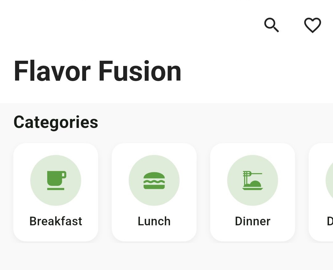
This creates:
- A horizontally scrollable list of category cards
- Each card has a circular icon and label
- Appropriate icons for each food category
Creating the Popular Recipes Section
Now let’s add a header for our popular recipes section:
// Add after the categories section
SliverToBoxAdapter(
  child: Padding(
    padding: EdgeInsets.only(left: 16, right: 16, top: 16, bottom: 0),
    child: Row(
      mainAxisAlignment: MainAxisAlignment.spaceBetween,
      children: [
        Text(
          'Popular Recipes',
          style: TextStyle(
            fontSize: 20,
            fontWeight: FontWeight.bold,
          ),
        ),
        TextButton(
          onPressed: () {},
          child: Text('View All'),
        ),
      ],
    ),
  ),
),
Creating the Recipe Card Widget
Before we can display recipes in our list, we need to create a reusable RecipeCard widget. Create a new file at lib/presentation/list/components/recipe_card.dart:
import 'package:flutter/material.dart';
import 'package:recipe_app/data/recipe.dart';

class RecipeCard extends StatelessWidget {
  final Recipe recipe;

  const RecipeCard({super.key, required this.recipe});

  @override
  Widget build(BuildContext context) {
    return Container(
      margin: EdgeInsets.symmetric(horizontal: 16, vertical: 8),
      decoration: BoxDecoration(
        color: Colors.white,
        borderRadius: BorderRadius.circular(20),
        boxShadow: [
          BoxShadow(
            color: Colors.black.withOpacity(0.05),
            offset: Offset(0, 3),
            blurRadius: 10,
          ),
        ],
      ),
      child: Column(
        crossAxisAlignment: CrossAxisAlignment.start,
        children: [
          Stack(
            children: [
              ClipRRect(
                borderRadius: BorderRadius.vertical(top: Radius.circular(20)),
                child: Container(
                  height: 180,
                  width: double.infinity,
                  color: Theme.of(context).primaryColor.withOpacity(0.1),
                  child: Icon(
                    Icons.image,
                    size: 80,
                    color: Theme.of(context).primaryColor.withOpacity(0.2),
                  ),
                ),
              ),
              Positioned(
                top: 12,
                right: 12,
                child: Container(
                  padding: EdgeInsets.symmetric(horizontal: 10, vertical: 6),
                  decoration: BoxDecoration(
                    color: Colors.white.withOpacity(0.9),
                    borderRadius: BorderRadius.circular(20),
                  ),
                  child: Row(
                    children: [
                      Icon(Icons.star, color: Colors.amber, size: 16),
                      SizedBox(width: 4),
                      Text(
                        '${recipe.rating}',
                        style: TextStyle(fontWeight: FontWeight.bold),
                      ),
                    ],
                  ),
                ),
              ),
            ],
          ),
          Padding(
            padding: EdgeInsets.all(16),
            child: Column(
              crossAxisAlignment: CrossAxisAlignment.start,
              children: [
                Text(
                  recipe.name,
                  style: TextStyle(
                    fontSize: 18,
                    fontWeight: FontWeight.bold,
                  ),
                  maxLines: 1,
                  overflow: TextOverflow.ellipsis,
                ),
                SizedBox(height: 6),
                Row(
                  children: [
                    CircleAvatar(
                      radius: 12,
                      backgroundColor: Theme.of(context).primaryColor.withOpacity(0.1),
                      child: Text(
                        recipe.chef.substring(0, 1),
                        style: TextStyle(
                          fontSize: 12,
                          color: Theme.of(context).primaryColor,
                          fontWeight: FontWeight.bold,
                        ),
                      ),
                    ),
                    SizedBox(width: 8),
                    Text(
                      recipe.chef,
                      style: TextStyle(color: Colors.grey),
                    ),
                  ],
                ),
                SizedBox(height: 12),
                Row(
                  children: [
                    _buildInfoChip(context, Icons.timer, recipe.cookTime),
                    SizedBox(width: 12),
                    _buildInfoChip(context, Icons.equalizer, recipe.difficulty),
                  ],
                ),
              ],
            ),
          ),
        ],
      ),
    );
  }

  Widget _buildInfoChip(BuildContext context, IconData icon, String text) {
    return Container(
      padding: EdgeInsets.symmetric(horizontal: 10, vertical: 6),
      decoration: BoxDecoration(
        color: Theme.of(context).primaryColor.withOpacity(0.1),
        borderRadius: BorderRadius.circular(20),
      ),
      child: Row(
        children: [
          Icon(icon, size: 16, color: Theme.of(context).primaryColor),
          SizedBox(width: 4),
          Text(
            text,
            style: TextStyle(
              fontSize: 12,
              fontWeight: FontWeight.w500,
              color: Theme.of(context).primaryColor,
            ),
          ),
        ],
      ),
    );
  }
}
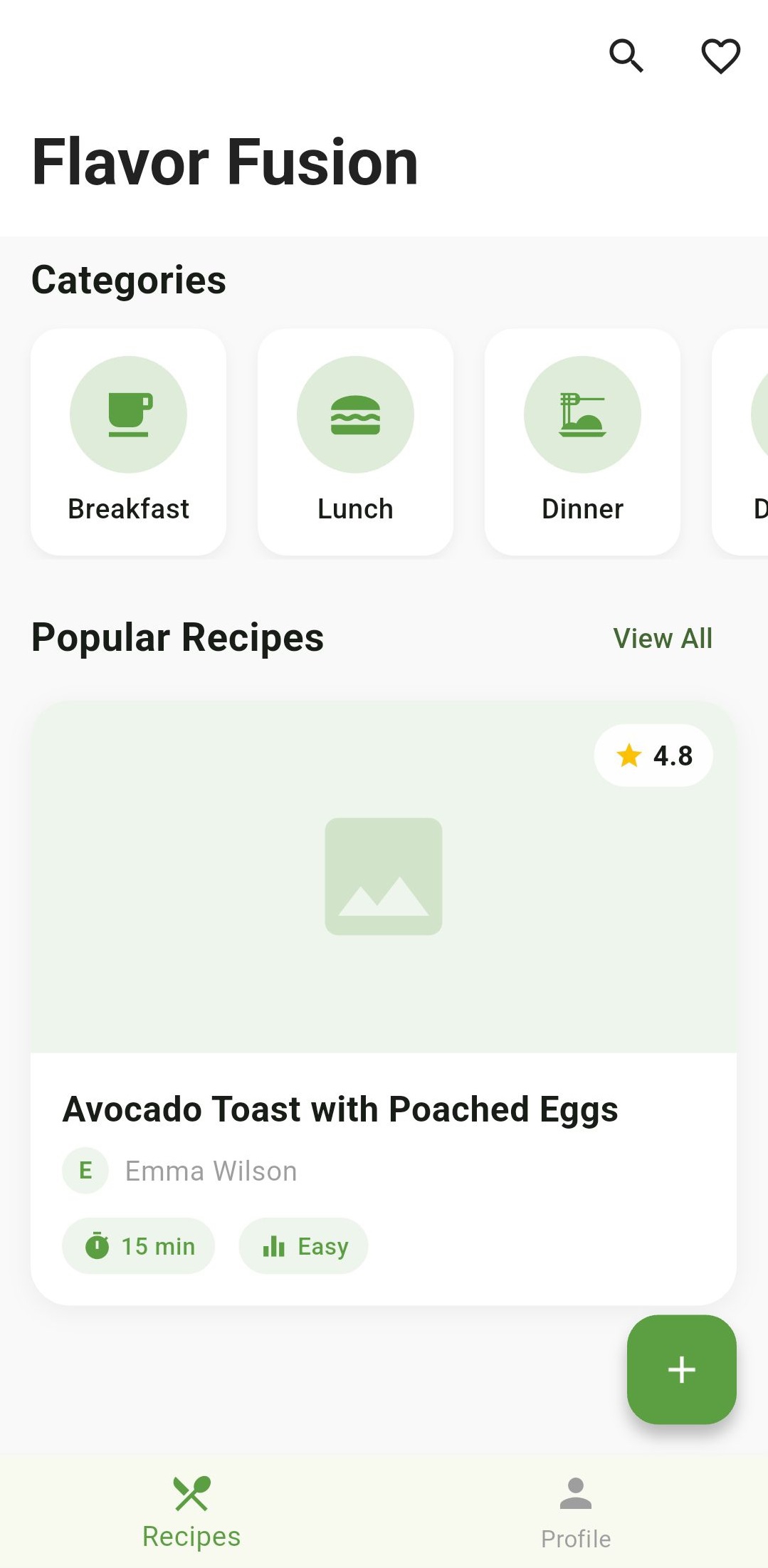
This creates a beautiful card layout for each recipe with:
- A placeholder for the recipe image
- Rating badge in the top right corner
- Recipe name and chef info
- Cook time and difficulty level chips
Now we can use this RecipeCard widget in our RecipeListScreen.
Updating the Recipe List Screen
Now that we have our RecipeCard component, let’s update our RecipeListScreen to use it. Update the lib/presentation/list/recipe_list_screen.dart file:
import 'package:flutter/material.dart';
import 'package:recipe_app/data/dummy.dart';
import 'package:recipe_app/presentation/list/components/recipe_card.dart';

class RecipeListScreen extends StatelessWidget {
  const RecipeListScreen({super.key});

  @override
  Widget build(BuildContext context) {
    return Scaffold(
      backgroundColor: Color(0xFFF9F9F9),
      body: CustomScrollView(
        slivers: [
          SliverAppBar(
            expandedHeight: 120,
            floating: true,
            pinned: true,
            backgroundColor: Colors.white,
            elevation: 0,
            flexibleSpace: FlexibleSpaceBar(
              title: Text(
                'Flavor Fusion',
                style: TextStyle(
                  color: Colors.black87,
                  fontWeight: FontWeight.bold,
                ),
              ),
              centerTitle: false,
              titlePadding: EdgeInsets.only(left: 16, bottom: 16),
            ),
            actions: [
              IconButton(
                icon: Icon(Icons.search, color: Colors.black87),
                onPressed: () {},
              ),
              IconButton(
                icon: Icon(Icons.favorite_border, color: Colors.black87),
                onPressed: () {},
              ),
            ],
          ),
          SliverToBoxAdapter(
            child: Padding(
              padding: EdgeInsets.symmetric(horizontal: 16, vertical: 8),
              child: Text(
                'Categories',
                style: TextStyle(
                  fontSize: 20,
                  fontWeight: FontWeight.bold,
                ),
              ),
            ),
          ),
          SliverToBoxAdapter(
            child: SizedBox(
              height: 120,
              child: ListView(
                padding: EdgeInsets.symmetric(horizontal: 8),
                scrollDirection: Axis.horizontal,
                children: [
                  _buildCategoryCard(
                      'Breakfast', 'assets/images/breakfast.jpg', context),
                  _buildCategoryCard(
                      'Lunch', 'assets/images/lunch.jpg', context),
                  _buildCategoryCard(
                      'Dinner', 'assets/images/dinner.jpg', context),
                  _buildCategoryCard(
                      'Desserts', 'assets/images/desserts.jpg', context),
                  _buildCategoryCard(
                      'Smoothies', 'assets/images/smoothies.jpg', context),
                ],
              ),
            ),
          ),
          SliverToBoxAdapter(
            child: Padding(
              padding: EdgeInsets.only(left: 16, right: 16, top: 16, bottom: 0),
              child: Row(
                mainAxisAlignment: MainAxisAlignment.spaceBetween,
                children: [
                  Text(
                    'Popular Recipes',
                    style: TextStyle(
                      fontSize: 20,
                      fontWeight: FontWeight.bold,
                    ),
                  ),
                  TextButton(
                    onPressed: () {},
                    child: Text('View All'),
                  ),
                ],
              ),
            ),
          ),
          SliverList(
            delegate: SliverChildBuilderDelegate(
              (context, index) {
                return RecipeCard(recipe: recipes[index]);
              },
              childCount: recipes.length,
            ),
          ),
        ],
      ),
      floatingActionButton: FloatingActionButton(
        onPressed: () {},
        backgroundColor: Theme.of(context).primaryColor,
        child: Icon(Icons.add, color: Colors.white),
      ),
    );
  }

  Widget _buildCategoryCard(
    String title,
    String imageUrl,
    BuildContext context,
  ) {
    return Padding(
      padding: EdgeInsets.symmetric(horizontal: 8, vertical: 2),
      child: GestureDetector(
        onTap: () {},
        child: Container(
          width: 100,
          decoration: BoxDecoration(
            borderRadius: BorderRadius.circular(15),
            color: Colors.white,
            boxShadow: [
              BoxShadow(
                color: Colors.black.withOpacity(0.05),
                blurRadius: 5,
                offset: Offset(0, 3),
              ),
            ],
          ),
          child: Column(
            mainAxisAlignment: MainAxisAlignment.center,
            children: [
              Container(
                height: 60,
                width: 60,
                decoration: BoxDecoration(
                  color: Theme.of(context).primaryColor.withOpacity(0.2),
                  shape: BoxShape.circle,
                ),
                child: Icon(
                  _getCategoryIcon(title),
                  color: Theme.of(context).primaryColor,
                  size: 30,
                ),
              ),
              SizedBox(height: 8),
              Text(
                title,
                style: TextStyle(
                  fontWeight: FontWeight.w500,
                  fontSize: 14,
                ),
              ),
            ],
          ),
        ),
      ),
    );
  }

  IconData _getCategoryIcon(String category) {
    switch (category) {
      case 'Breakfast':
        return Icons.free_breakfast;
      case 'Lunch':
        return Icons.lunch_dining;
      case 'Dinner':
        return Icons.dinner_dining;
      case 'Desserts':
        return Icons.cake;
      case 'Smoothies':
        return Icons.local_drink;
      default:
        return Icons.restaurant;
    }
  }
}
Running the App
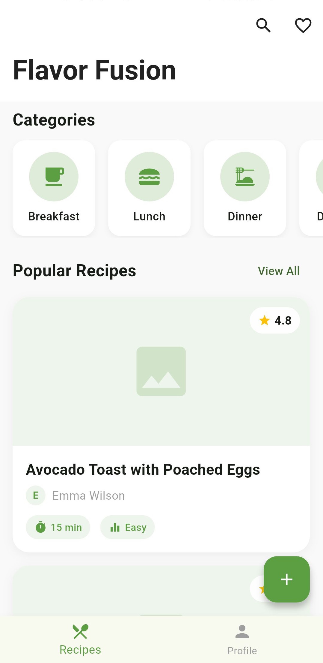
With all these components in place, we can now run our app and see the beautiful home screen in action. You should see a screen with:
- A collapsible app bar with our app name and action icons
- A horizontal scrolling list of food categories
- A “Popular Recipes” section showing recipe cards
- A floating action button for adding new recipes
- A bottom navigation bar to switch between screens
[Image: Full app screenshot showing the complete home screen]
Adding More Recipes
Now that your app is running, you can add more recipes to the dummy data. Open lib/data/dummy.dart and add more recipes to the recipes list. Here’s an example of how to add another recipe:
// Add this to the recipes list in lib/data/dummy.dart
Recipe(
  name: "Chicken Tikka Masala",
  chef: "Sarah Patel",
  imageUrl: "assets/images/chicken_tikka.jpg",
  cookTime: "45 min",
  difficulty: "Medium",
  rating: 4.7,
  ingredients: [
    "2 lbs chicken breast",
    "1 cup yogurt",
    "2 tbsp garam masala",
    "1 onion, diced",
    "3 cloves garlic",
    "1 can tomato sauce",
    "1 cup heavy cream",
    "Fresh cilantro",
    "Salt and pepper to taste",
  ],
  steps: [
    "Marinate chicken in yogurt and spices for 2 hours.",
    "Grill chicken until charred and cooked through.",
    "Sauté onions and garlic until soft.",
    "Add tomato sauce and simmer for 10 minutes.",
    "Add cream and cooked chicken, simmer for 5 minutes.",
    "Garnish with fresh cilantro and serve with rice.",
  ],
),
You can add as many recipes as you want following this pattern. Each recipe should include:
- A descriptive name
- Chef’s name
- Image URL (for now, we’re using placeholders)
- Cook time
- Difficulty level
- Rating
- List of ingredients
- Step-by-step instructions
The recipes will automatically appear in your app’s list view. Try adding a few more recipes to see how they look!

Conclusion
In this first part of our tutorial series, we’ve created the foundation of our recipe app, including:
- Setting up the app theme and structure
- Creating our data models
- Building a home screen with navigation
- Implementing a dynamic recipe list screen with SliverAppBar
- Creating custom category cards and recipe cards
In the next part, we’ll focus on building the recipe detail screen where users can view full recipes with ingredients and steps.
Stay tuned for Part 2!
What’s Next
In Part 2, we’ll create:
- A detailed recipe view with image, description, and metadata
- An ingredients list with custom styling
- Step-by-step cooking instructions
- Action buttons for saving and sharing recipes
Happy coding!

